This post was originally shared via my weekly newsletter where I share actionable advice about solving problems for online businesses. If you enjoy my writing, please sign up and you won’t miss a post from me!
Content is the reason why people visit your website
In recent months, I have been dedicating more time to the research phase of a website project and in particular a website’s information architecture.
Information Architecture is the organization of content on your website.
Why Information Architecture Shouldn’t Be an Afterthought
In the past I’ve immediately dived into designing a website because I’m a visual/creative person and like to “see” the website come together as quickly as possible.
When it came to the site’s navigation and organization, I would tell clients that a site’s organization can be easily tweaked because websites are fluid and can always be changed (versus a printed book that has no flexibility post production).
While designing the website, I would assume a lot of things (why people visit the site, what content people are looking for, how people find it, etc.) and just trail-blaze through the design.
However, there are telling signs when the information architecture on a website is in poor shape.
🚩 Red Flags for Bad Information Architecture

Here are signs that your website may be organized in a confusing way:
1: “I Can’t Find X” - your customers
If a customer is looking for something on your website and then resorts to contacting you for help — that’s a sign that you’ve got an information architecture issue larger than one customer. This customer is at least going out of their way to contact you about what they are looking for. How many other customers just left your website?
2 Search queries show that people are confused
For a client redesign project, I recently looked up what users are searching for on their website (via Google Analytics). One of the most common search terms was “help”. This showed me that users are resorting to typing “help” into the site’s search bar because they have not been able to find the information they are looking for after multiple attempts.
3 You watch someone else navigate your website and you get frustrated with them
I welcome you to ask a friend or family member that is not a power user on your website to navigate your website and find a specific page of content. Do they wander around a lot? Do they get confused? Do you want to just take their phone out of their hands and show them where to go?
You can also use tracking software like Lucky Orange to view how users navigate your website in real time. You can see where they get stumped with your site’s organization and decide to leave your website.
As a power user of your own website, it will be hard to recognize flaws in your site’s information architecture. Seeing someone else navigate your website will be illuminating.
How To Conduct An Information Architecture Audit
1: Map Out Your Existing Content

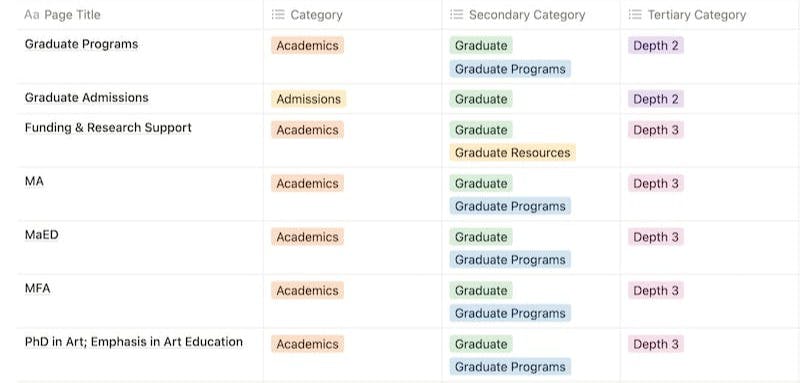
Create a spreadsheet of all the current pages on your site. I ❤️ spreadsheets and build them all the time on Notion & Airtable (I don’t touch excel!)
Label pages with a taxonomy. I typically categorize pages by their depth, audience and type. The content on your website will grow so make sure your approach to taxonomy and labelling is scalable.
2: Identify the Audiences of your website and what primary content they are looking for
Let’s use a retail store as an example, consider the following customer types:
People that are shopping for themselves, People that are shopping for their kids, People that are shopping for a gift, People that are return customers and are looking for information on their recent order, etc.
What content are they trying to find immediately on your website? That content should be clearly and quickly available to your customers.
3: Conduct User Research
- Review your site’s google analytics (if you have an account set-up) and see what pages are the most popular, what pages are least popular by comparison and what pages have the highest bounce rate.
- View the search inquiries people make on your site (possible via Google Analytics)
- View google search console reports to see the queries people are making to reach your site
- Add a website feedback form on your website or send out a website survey to learn more about how people use your website and what they are looking for
4: Card Sort the Information Architecture of Your Website
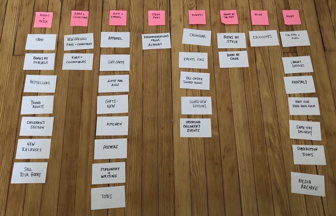
 Card sorting for Strand Bookstore from this Medium article
I recommend getting hands on with this part of the project! Get colored index cards and literally lay out the architecture of your site. Rearrange the index cards in a variety of methods. I recommend that you rearrange the information architecture for each audience type so you can consider different approaches.
5: Finalize your new site architecture & Monitor the Results
After you have considered the user research you’ve collected and gone through multiple iterations of your site’s information architecture, it’s time to choose the path of your site’s new information architecture.
Update your main menu, footer menu, sidebar menus, etc. with your new approach.
After you have made these updates, monitor your site’s performance.
Welcome Feedback. Make sure you have a “website feedback” form available on your website. Also, always ask customers if they had any difficulty finding what they were looking for as you provide general customer support.
Keep an Eye on Your Analytics & Search Queries. Check your site’s analytics on a weekly basis for the first few months after a major information architecture update. Look for improvements in bounce rate (when people leave your website) and conversion rate. Also keep an eye on the search queries of your website — have they changed since your recent information architecture audit or stayed the same? Are people still typing in “help” with no luck?
Based on user feedback and analytics, stay nimble and make tweaks and changes to the information architecture. Luckily websites are forever editable — so keep at it!
6: Conduct Seasonal Mini Information Architecture Audits

People will be searching for different content on your site based on the “seasons” of your business. Before you roll out a new course, giveaway or flash sale — make sure that your information architecture provides the most relevant and current information on your site. Don’t have your new course info or giveaway terms buried in the second dropdown of your main menu.
When your promotion is over, return your site’s information architecture back to it’s normal “evergreen” state.
